Use the Analyze feature
The Analyze feature provides you with further analysis that's generated by Power BI for a selected data point in a visual. You might use this feature to see if Power BI found something new or to gain new insights into your data. This feature is useful for analyzing why your data distribution looks the way that it does.
Note
This feature doesn't work if you have non-numeric filters applied to your visual and/or you have measure filters applied.
Consider a scenario where you're developing a report for the Customer Service team that deals with help tickets. They want to analyze the ticketing data created online when a customer asks a question.
After creating a visual displaying tickets by location, you're curious about the distribution. Instead of exploring the data manually, you can use the Analyze feature to get fast, automated, insightful analysis of your data.
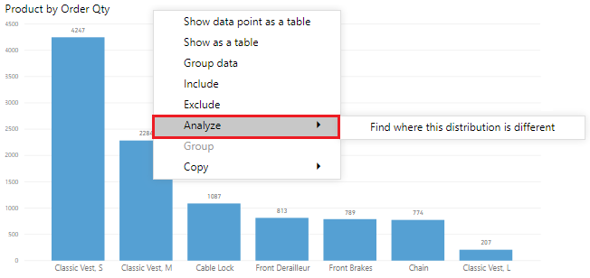
To use the Analyze feature, right-click a data point on the visual and then hover over the Analyze option to display two further options: Explain the increase and Find where the distribution is different. The options that are available depends on the data point that you selected.
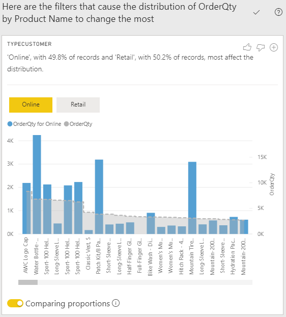
In the following image, you select the Explain the increase option, and a window opens with a new visual.
If you find this analysis useful, you can add any of the new visuals to the report so that other users can benefit from it. Select the plus (+) icon in the upper-right corner of the visual to add it to your report.
For more information about the Analyze feature, see Apply insights in Power BI Desktop to discover where distributions vary (preview).

