Use themes to quickly change the appearance of your app
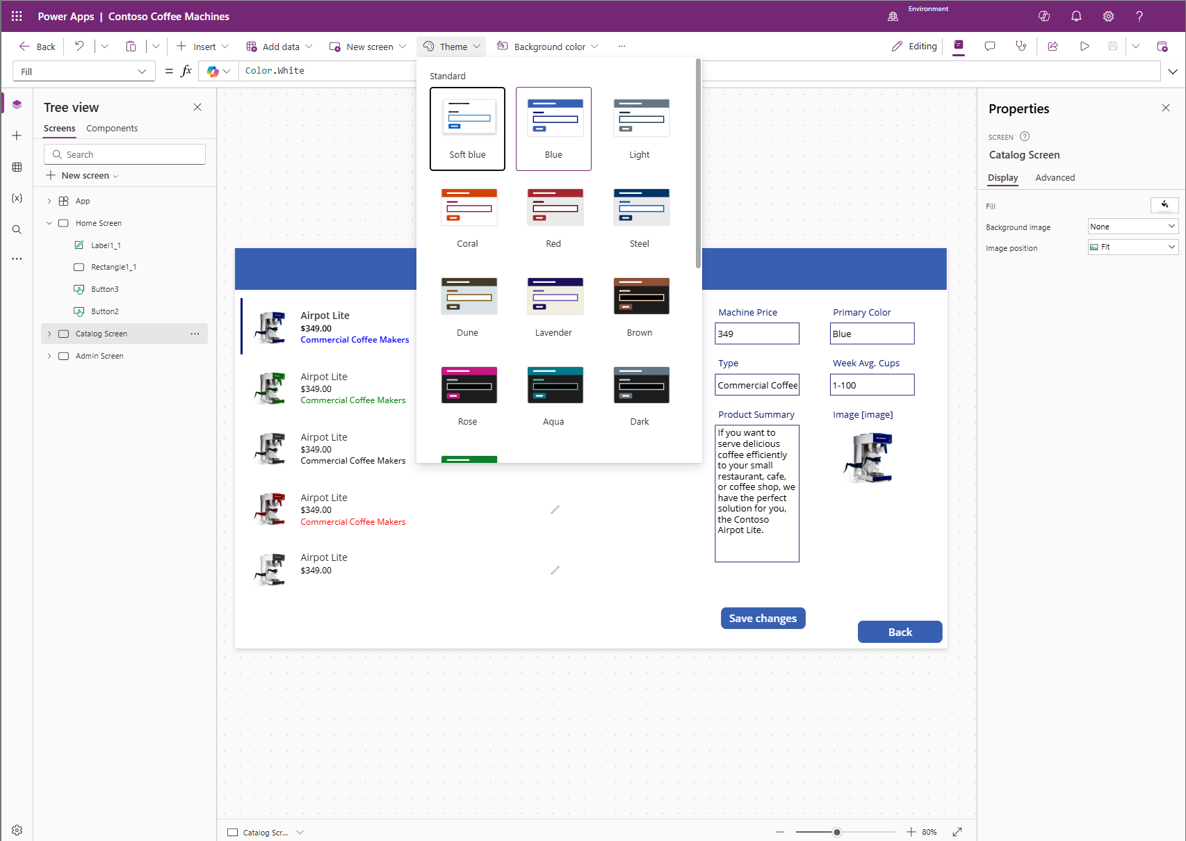
A quick and easy way to change the colors in your app is to apply a theme. Theming will change control properties like Fill and Color to make them the same throughout your app. In Microsoft Power Apps, there are more than 20 out-of-the-box themes to choose from. Theme options are available when you select a Screen or the App from your Tree view panel on the left side of the screen. The following screenshot shows where to find the Theme option button in your command bar and some of the themes immediately available for your app.
These themes have a specific set of default colors and visual elements, which alter the look and feel of your entire app. Once you select a theme, the changes to your app take effect immediately.
To see this in action, select the Lavender theme in the Contoso Coffee Machines app. The background color of the screen and the buttons update accordingly. If your app already includes light-colored text, avoid selecting darker themes such as those with black screen fills, as these can reduce text visibility. In this example, Lavender is a suitable choice.
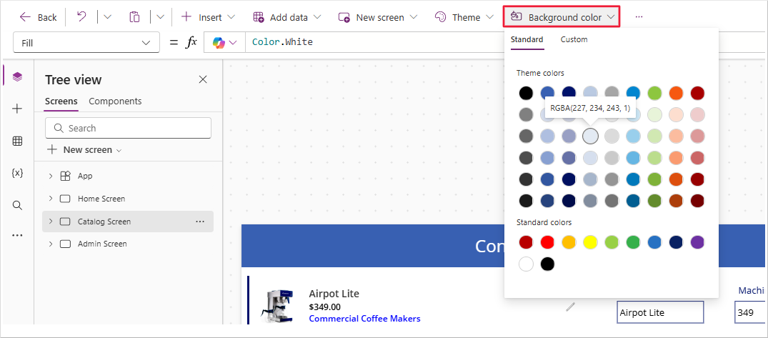
If none of the included themes meet your requirements, you can create a custom theme. For example, if you select the Steel theme but prefer a lighter background, you can modify the Fill property of the screen. To do this, select the screen from the Tree view panel. The command bar will then display Background color and Background image options next to the theme selector. These options vary based on the selected control. Power Apps helps make it easier to locate and modify properties.
Selecting Background color opens a palette of Theme and Standard colors. Hovering over a color circle displays an RGBA value label, which Power Apps interprets as data type: color. Selecting a color updates the Fill property of the selected control.
When you add a new blank screen, it defaults to a Fill property of Color.White. This behavior is expected when working in a canvas app. While themes apply broadly, you can modify individual controls using the command bar options.
Using a theme in Power Apps offers several benefits. It applies a consistent design to all theme able controls with a single selection. Additionally, newly added controls inherit the selected theme, maintaining visual consistency across your app.
Tip
If you modify any control colors prior to applying a theme, Power Apps doesn't override those settings. This behavior supports flexibility in how you apply custom theming.
Many organizations begin by selecting a theme that aligns with their requirements and then adjust control properties to match their branding guidelines. The next unit covers how to implement organizational branding.

