Configure parameters
A parameter in Power BI lets users change report settings, like filters or calculations, without changing the original data. You can add two types of parameters to your model: Numeric range and Fields.
Create a Numeric range parameter
You define a Numeric range parameter by setting a numeric data type, minimum and maximum values, an increment value, and a default value. Power BI Desktop then creates a calculated table by using DAX. It also creates a measure that represents the value that's used to the filter the table. The table doesn't have (or need) a relationship to any other model table, creating a disconnected table.
A numeric range parameter can support a what-if scenario, where the report consumer uses a slicer to filter the table, and measures do something relevant with the selected value. For example, a report could allow the report consumer to set a hypothetical currency exchange rate. A report visual could then display a measure that applies the exchange rate in a meaningful way.
Parameters appear in the Data pane with a question mark symbol (?).
In the following screenshot, the Exchange Rate table is the calculated table, and the Exchange Rate column contains the numeric range values. The Exchange Rate Value is a measure that returns the select value in the range.
Create a Fields parameter
You can define a Fields parameter by creating a group of different fields. The parameter field can then be used in visuals and also to set up a slicer. Slicer selection allows report consumers to choose which field to visualize.
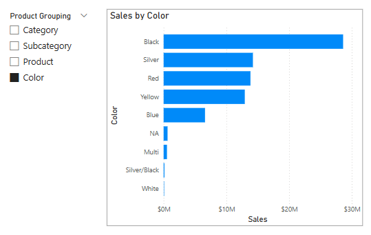
Consider an example where a fields parameter named Product Grouping comprises four columns from the Product table: Category, Subcategory, Product, and Color. When the parameter is added to the report page, the report consumer can select which field. The corresponding bar chart places the selected field on its Y-axis.

