Identify components to make a canvas app mobile-optimized
In this unit, you'll learn about Microsoft Power Apps components that help you create a mobile-optimized app. Topics include:
Canvas app creation
Application display settings
Responsive forms
Control and form design considerations
Containers
Offline capabilities
Connectivity alerts
Create a canvas app
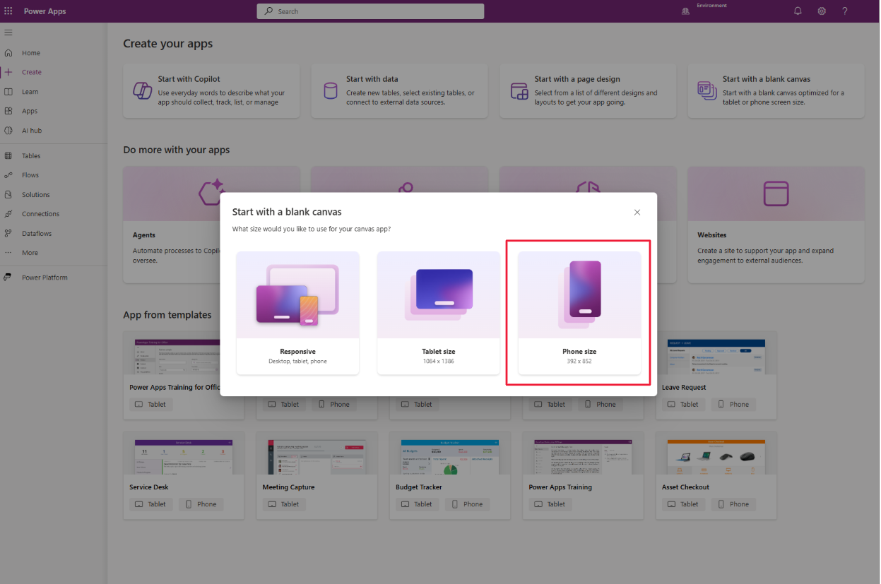
After you complete your planning, go to the Power Apps home page, select Create, and choose Start with a blank canvas. Microsoft Power Apps prompts you to select a Format option before the app is created. This is your first opportunity to select a form factor—such as phone, tablet, or responsive layout—that aligns with your app's intended mobile experience.
You can select a layout for a phone or tablet. A phone layout assumes vertical orientation with vertical scrolling. A tablet layout assumes landscape orientation. Responsive layouts use predefined container templates designed to adjust to screen size, but you must use the containers for this feature to work correctly.
Configure display settings
While editing the app, go to Settings > Display to adjust layout options.
Orientation: Sets default layout—portrait or landscape.
Scale to fit: Turn this option Off for responsive design. It's On by default.
Lock aspect ratio: Maintains height-to-width ratio when Scale to fit is On.
Lock orientation: When On, the orientation setting is enforced. When Off, users can switch between orientations based on device handling.
Use responsive layouts
From the Layout tab when adding a new screen, you can select built-in responsive templates like Split screen, Sidebar, or Header and footer. These adapt automatically to different devices.
If none of these meet your needs, create a custom responsive layout using containers, formulas, and conditional logic.
Design controls and forms for mobile
Design buttons so they're easily tapped, ideally located at the top or bottom of the screen and extending edge to edge. Place action buttons, like delete, on the side that aligns with user hand preference.
Add spacing between fields and screen edges to reduce touch errors. This helps prevent focus from shifting unintentionally or triggering system gestures. Display mandatory fields near the top of the form.
Grids should scroll in only one direction—either vertically or horizontally—and span the screen width. If you use multiple forms, ensure scrolling behavior is consistent.
Use containers to organize controls
Containers help organize and align controls. Horizontal container and Vertical container controls use auto-layout features to set the position of child elements and distribute space. Use these to maintain responsive behavior across different form factors.
Auto-layout containers are helpful when you want Power Apps to manage spacing and alignment dynamically.
Enable offline capabilities
Microsoft Power Apps Mobile can store data locally and sync it when connectivity resumes. Use the SaveData and LoadData functions to persist and retrieve data from device storage. The ClearData function deletes stored data.
Alert users when offline
Use the Connection signal to monitor connectivity status. For example, an Icon control can change color based on connection state. You can also use the Notify function to display messages or disable controls conditionally.
