Note
Access to this page requires authorization. You can try signing in or changing directories.
Access to this page requires authorization. You can try changing directories.
[This article is prerelease documentation and is subject to change.]
Configure and use vertical bar charts in the process intelligence experience to compare process metrics across categories with optional overlapping line charts.
Important
- This is a preview feature.
- Preview features aren’t meant for production use and may have restricted functionality. These features are available before an official release so that customers can get early access and provide feedback.
- For more information, go to our preview terms.
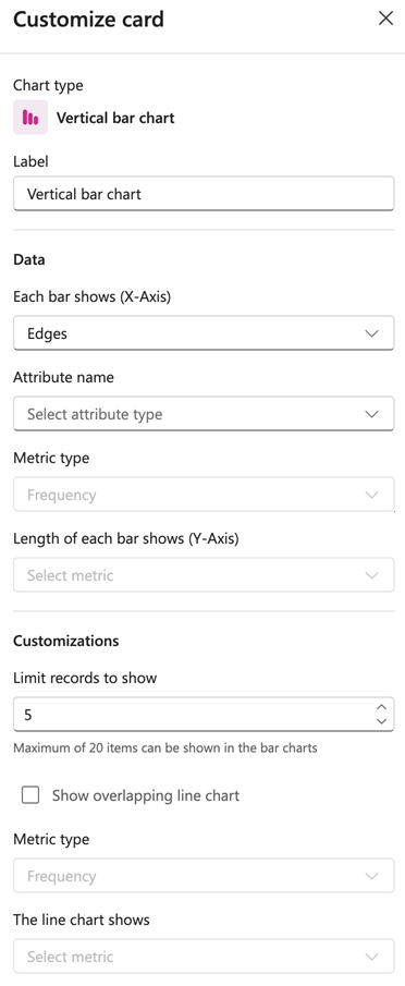
Label
Enter a name for your vertical bar chart.
Data
Each bar shows (X-Axis): Select what each bar represents from the dropdown menu (for example, Edges, Variants, or Attribute).
Attribute name: Select the attribute to display.
Metric type: Choose the type of metric to measure (for example, Frequency, Performance, Rework, or Finance).
Length of each bar shows (Y-Axis): Select the specific metric to display on the Y-axis.
Customizations
Limit records to show: Set the number of records to display. The default is 5.
Note
You can display a maximum of 20 items in the bar charts.
Show overlapping line chart: Enable this checkbox to overlay a line chart on top of the bar chart.
Metric type: Select the metric type for the line chart (for example, Frequency, Performance, Rework, or Finance).
The line chart shows: Select the specific metric to display on the line chart.