Note
Access to this page requires authorization. You can try signing in or changing directories.
Access to this page requires authorization. You can try changing directories.
[This article is prerelease documentation and is subject to change.]
Configure and use line charts in the process intelligence experience to display process metric trends and changes over time with connected data points.
Important
- This is a preview feature.
- Preview features aren’t meant for production use and may have restricted functionality. These features are available before an official release so that customers can get early access and provide feedback.
- For more information, go to our preview terms.
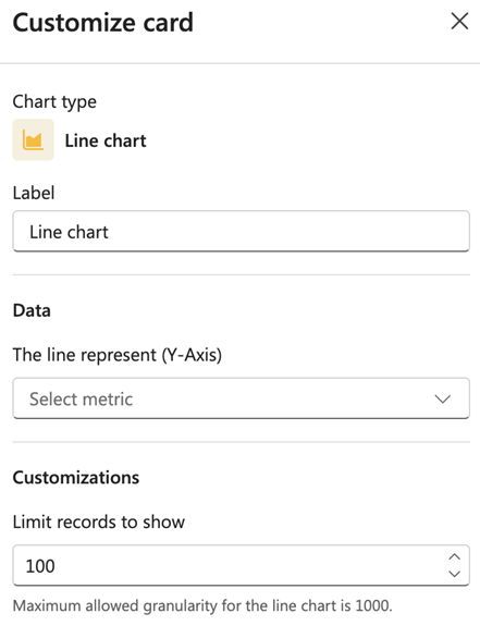
Label
Enter a label for the chart.
Data
From the dropdown menu in The line represent (Y-Axis) field, select the metric to display on the Y-axis.
Customizations
In the Limit records to show field, enter the number of records to display. The default is 100.
Note
Maximum allowed granularity for the line chart is 1000.