Note
Access to this page requires authorization. You can try signing in or changing directories.
Access to this page requires authorization. You can try changing directories.
[This article is prerelease documentation and is subject to change.]
Donut charts in the process intelligence experience allow you to visualize proportional process data in a circular format with segmented categories.
Important
- This is a preview feature.
- Preview features aren’t meant for production use and may have restricted functionality. These features are available before an official release so that customers can get early access and provide feedback.
- For more information, go to our preview terms.
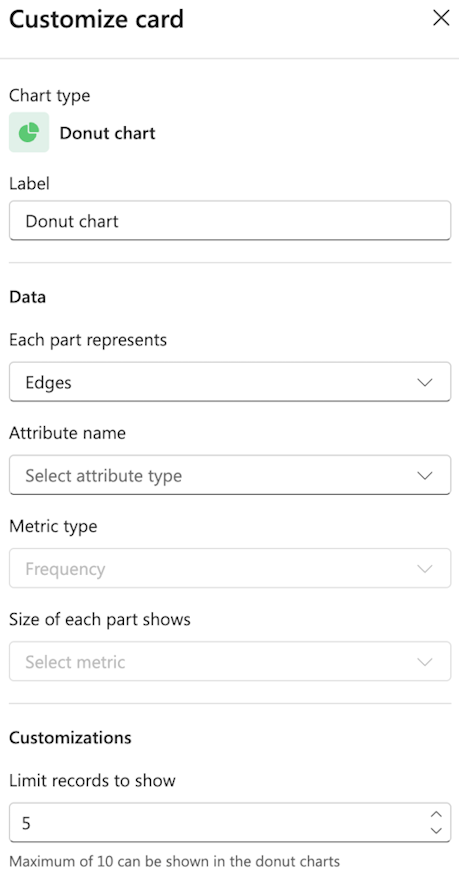
Label
Enter a custom label for the chart.
Data
Each part represents: From the dropdown menu, select what each part represents from the dropdown (for example, Edges, Variants, or Attribute).
Attribute name: Select the specific attribute for the category.
Metric type
Choose the metric type (for example, Frequency, Performance, Rework, or Finance).
Size of each part shows
Select the metric that determines segment size.
Customizations
Limit records to show: Set the number of records to display. The default is 5.
Note
You can show a maximum of 10 in the donut charts.