Note
Access to this page requires authorization. You can try signing in or changing directories.
Access to this page requires authorization. You can try changing directories.
[This article is prerelease documentation and is subject to change.]
Copilot enables you to visualize the data in the view in the form of a chart to help you understand trends, patterns and relations in your data easily. The visualization is interactive, based on the visible columns in the view, and can be personalized to support further data exploration.
Prerequisites
- Copilot assistance is available for all model-driven apps on the web where the modern, refreshed look is turned on.
- Your administrator must enable Allow AI to generate charts to visualize the data in a view setting in Power Platform admin center.
Important
- This is a preview feature.
- Preview features aren’t meant for production use and might have restricted functionality. These features are subject to supplemental terms of use, and are available before an official release so that customers can get early access and provide feedback.
Visualize data in a view
To use this Copilot visualization, your administrator must enable it. For more information on how to enable Copilot visualization, see Manage feature settings.
When you navigate to a grid page, you can see the Visualize option on top of the page.

When you select Visualize, the chart pane opens next to the grid, complementing the table of rows. If the table has system or personal charts, the default chart for the table is shown. If the table doesn't have charts, Copilot generates a visualization for the view based on the visible columns and filters. The visualization is a chart that aggregates the data in the view.


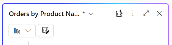
If Copilot generates a visualization for the view, you can edit the chart by changing the chart type, the columns that are visualized, or both. If you add or remove columns from the view, Copilot regenerates the chart based on the updated set of columns for the visualization. If you add or remove filters, Copilot refreshes the chart without changing the visualization. The asterisk (*) next to the chart name shows that the chart isn't saved yet.
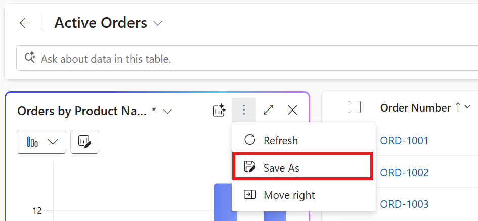
Select the three dots in the top-right corner of the chart pane, and then select Save As to save the chart.
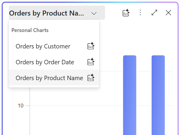
Copilot automatically populates the chart name and description, but you can edit them to suit your needs. Select Save to save the chart. You access the saved chart using the chart switcher in the chart pane. The Visualize icon next to the chart name indicates that it is an AI-generated chart, helping you distinguish it from other charts.
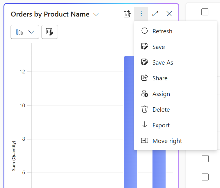
To manage a personal chart, select the chart in the chart switcher, then select the three dots in the top-right corner of the chart pane. Select an option to delete, assign, or share the chart with others in your organization.
Hover over the charts to examine data points or select chart elements to drill into the data. The grid filters rows automatically to match the selected area of the chart. Selecting the same area of the chart again toggles the selection and removes the filter.
Note
Charts created with the legacy chart designer use the same styling as AI-generated charts. To learn how to turn off the styling update for charts created with the legacy chart designer, see Manage feature settings.
Visualize data in a view with natural language
You use natural language prompts in the Copilot bar on the grid page to visualize data in the view. Here are example prompts to help you understand the types of requests supported.
- Visualize data as a bar chart.
- Customers by location. Use the prompt [table name] by [column] generically depending on the table you're visualizing.
- Trend of orders created during this fiscal year.
- Visualize average revenue per month as a column chart.
- Visualize high-priority cases as a chart.
- Visualize data as a bubble chart.
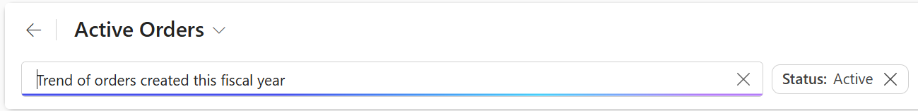
Chart pane
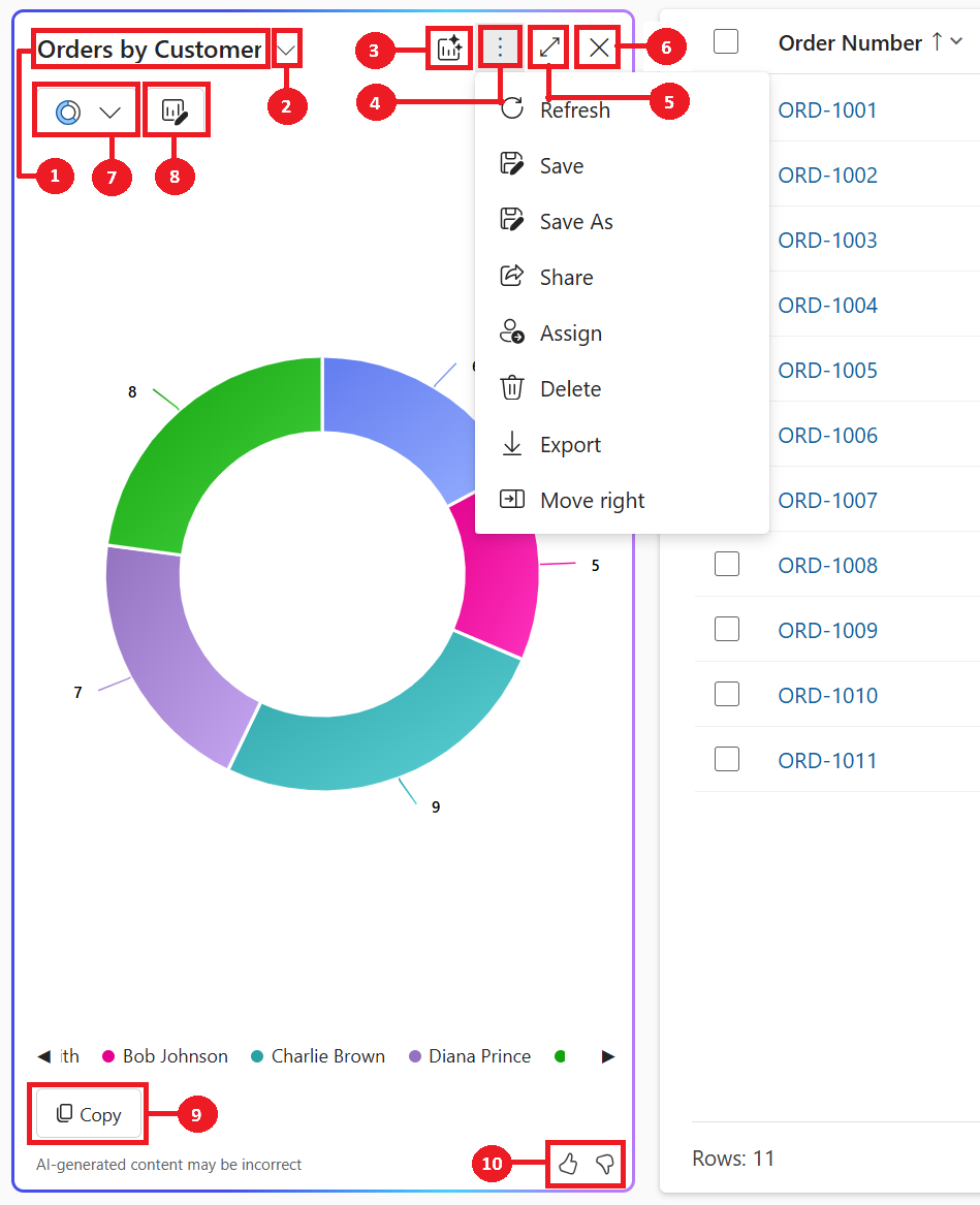
- Chart title: AI-generated title for the chart based on the data and columns visualized.
- Chart switcher: Lets you select and manage saved charts. Use it to switch between different charts, including AI-generated and personal charts, for the current view.
- Create new chart with AI: AI-generated chart for the visualization that Copilot chose for this view.
- Commands to manage saved chart: The Commands to manage saved chart appear as three dots in the top-right corner of the chart pane. They provide options to perform actions on saved charts.
- Expand: Select Expand to expand the chart to full screen for a better view of the chart area.
- Close: Select Close to close the chart pane.
- Chart selector: List of eleven supported chart types – Pie, Donut, Bar, Column, Clustered Bar, Stacked Bar, Clustered Column, Stacked Column, Line, Histogram and Bubble chart.
- Edit chart columns: This option allows you to customize the chart by selecting which columns from the view are visualized.
- Copy: Select Copy to copy the chart as a PNG file to the clipboard.
- Feedback: Select Thumbs up or Thumbs Down to provide feedback about the feature.
To provide feedback about the feature, select the thumbs up or down button on the chart pane, and provide detailed comments to help improve the feature.
Related information
Manage feature settings
Responsible AI FAQ about Copilot visualizations on a view